
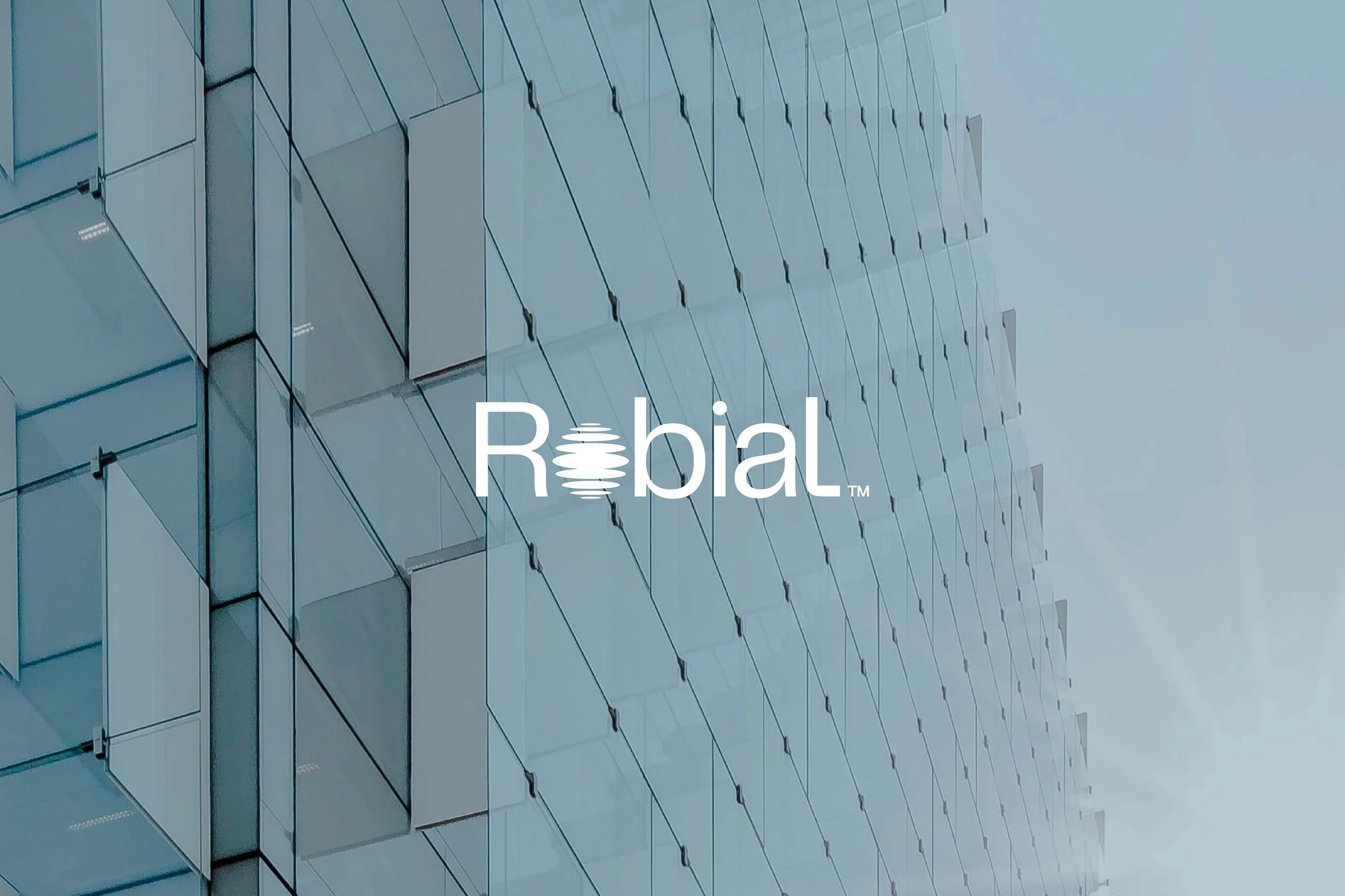
Robial
Robial is an ecological water and wastewater engineering firm developing sustainable treatment and reuse solutions that put the planet first.
SCOPE
Branding Strategy
Logo Design
Visual Identity
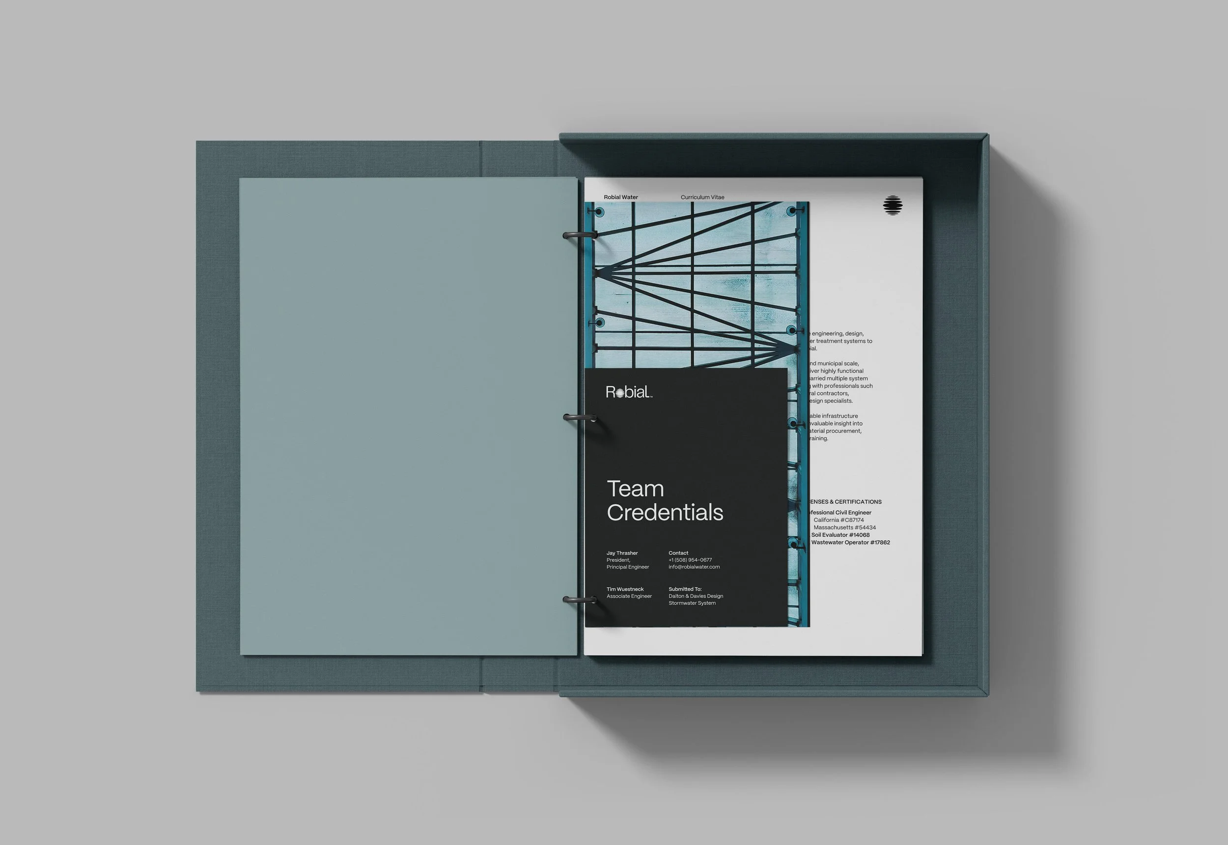
Copywriting
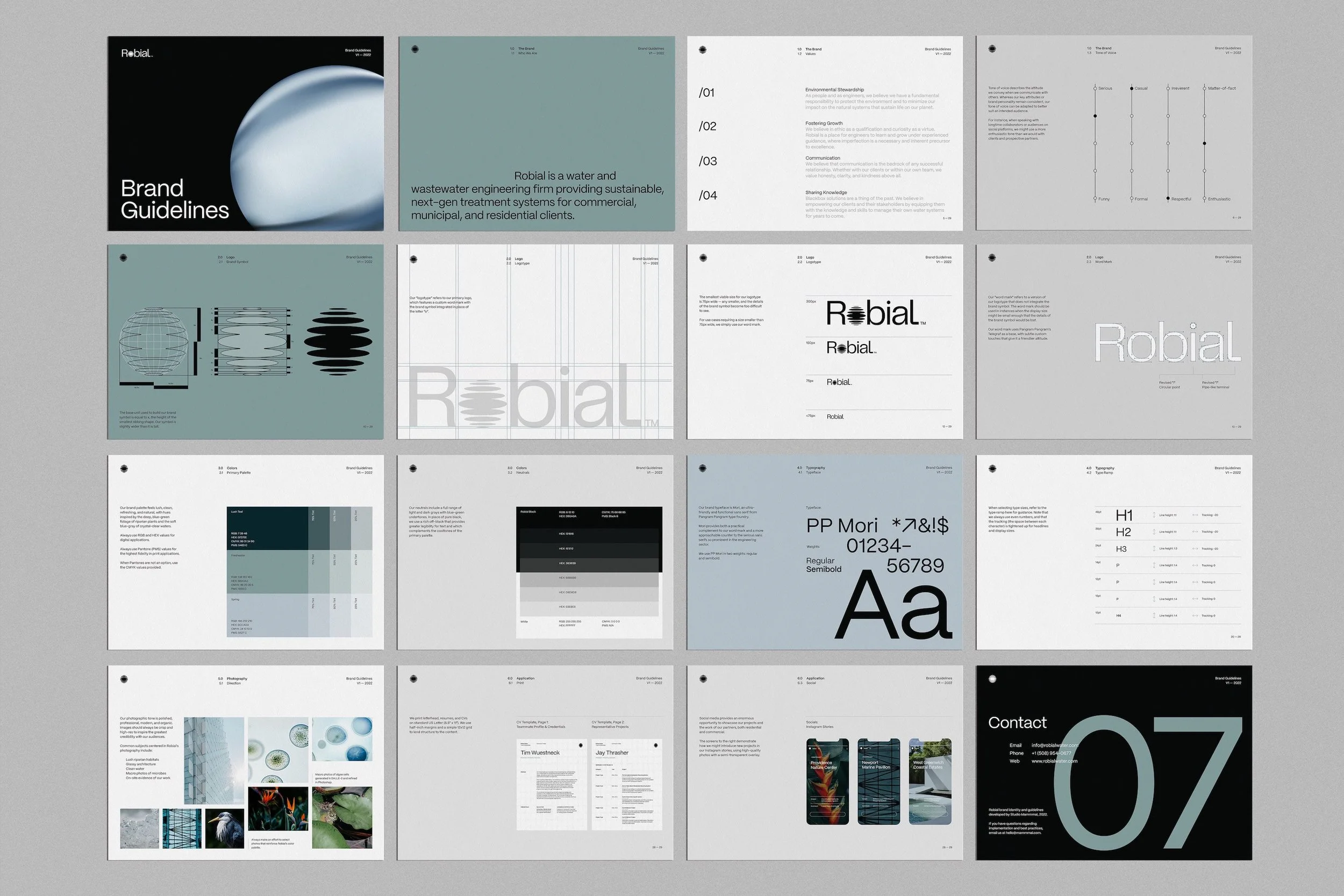
Brand Guide
Digital Templates
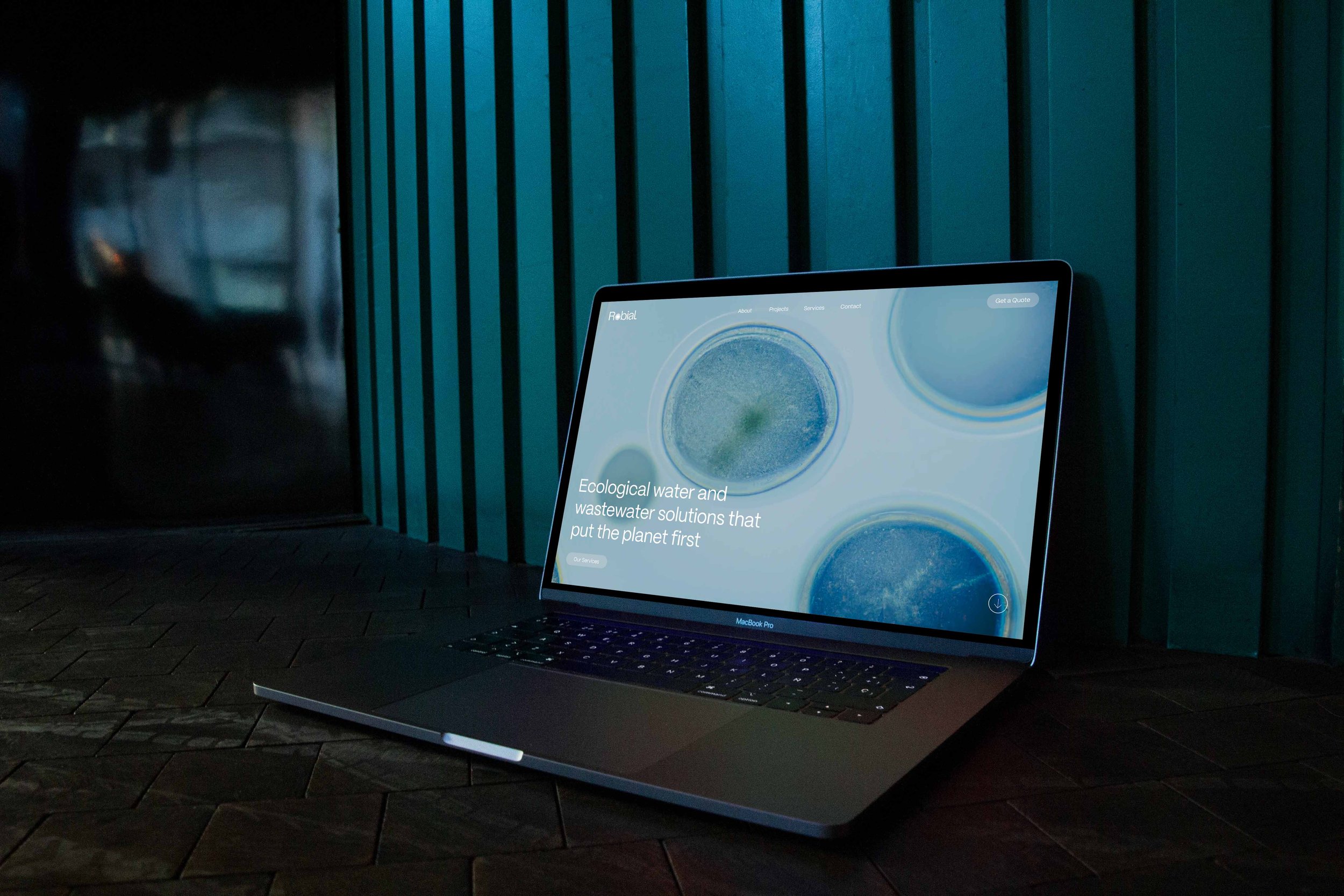
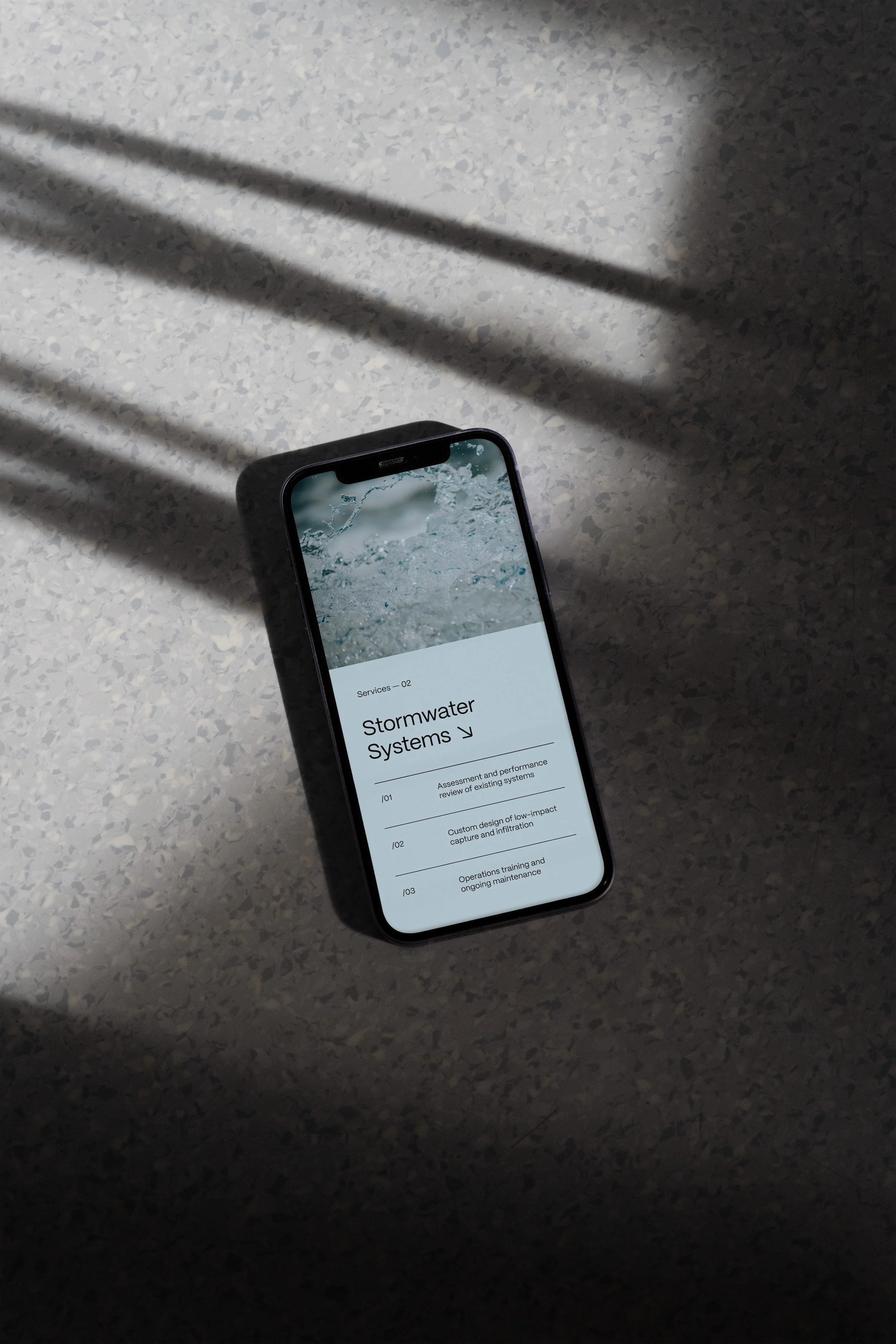
Website (Forthcoming)
PROJECT
Brand Identity
YEAR
2022
Robial is a water and wastewater engineering firm providing sustainable, next-gen solutions for commercial, municipal and residential clients. Unlike traditional, chemical wastewater treatment, ecological wastewater solutions rely on natural microbial processes to create a closed-loop, self-sustaining, regenerative system. Sludge moves through tiered microbial treatments and eventually into constructed wetlands, where it is further processed and cleaned by an ecosystem of mollusks, fish, and aquatic plants.
Although pioneered decades ago, ecological wastewater engineering remains lesser-known and less favored than traditional, black-box solutions that do little to support the longterm health of the environment.
Robial's founder approached Mammmal about developing a visual identity that would help transform general perception about wastewater's potential as a renewable resource, and which could position the firm as a premium competitor in a landscape dominated by traditional engineering techniques.

Our work began with extensive discovery, learning all we could about Robial's peers and competitors, researching the history and essential processes of wastewater engineering, and narrowing in on three high-priority target demographics.
This discovery period resulted in a clearly defined market position, tone of voice, brand values, central brand concept, and creative direction. As a starting point for our visual communications, we devised a lush, riparian palette that would challenge the most fundamental association with wastewater — the "ick" factor — by setting a deeply refreshing tone for the brand.
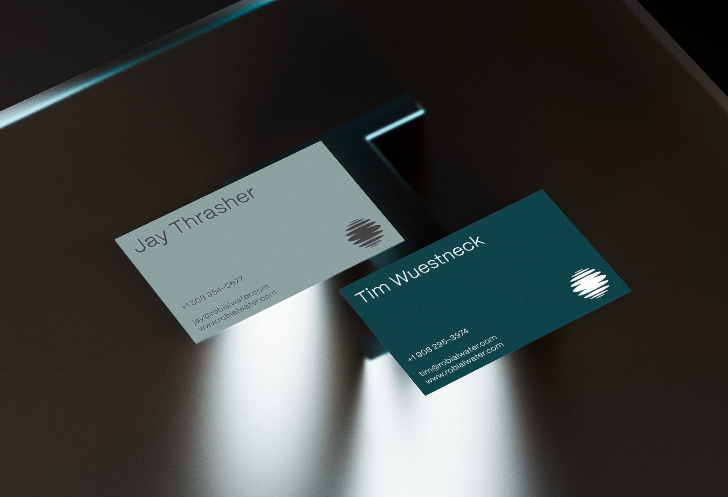
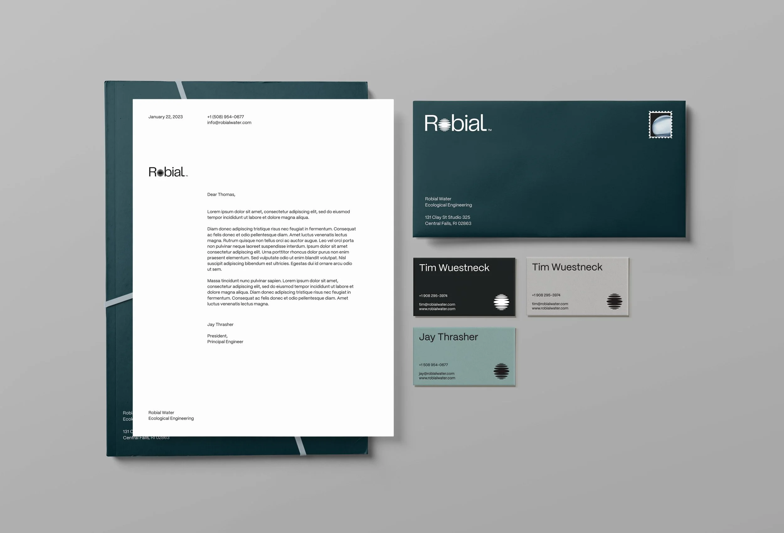
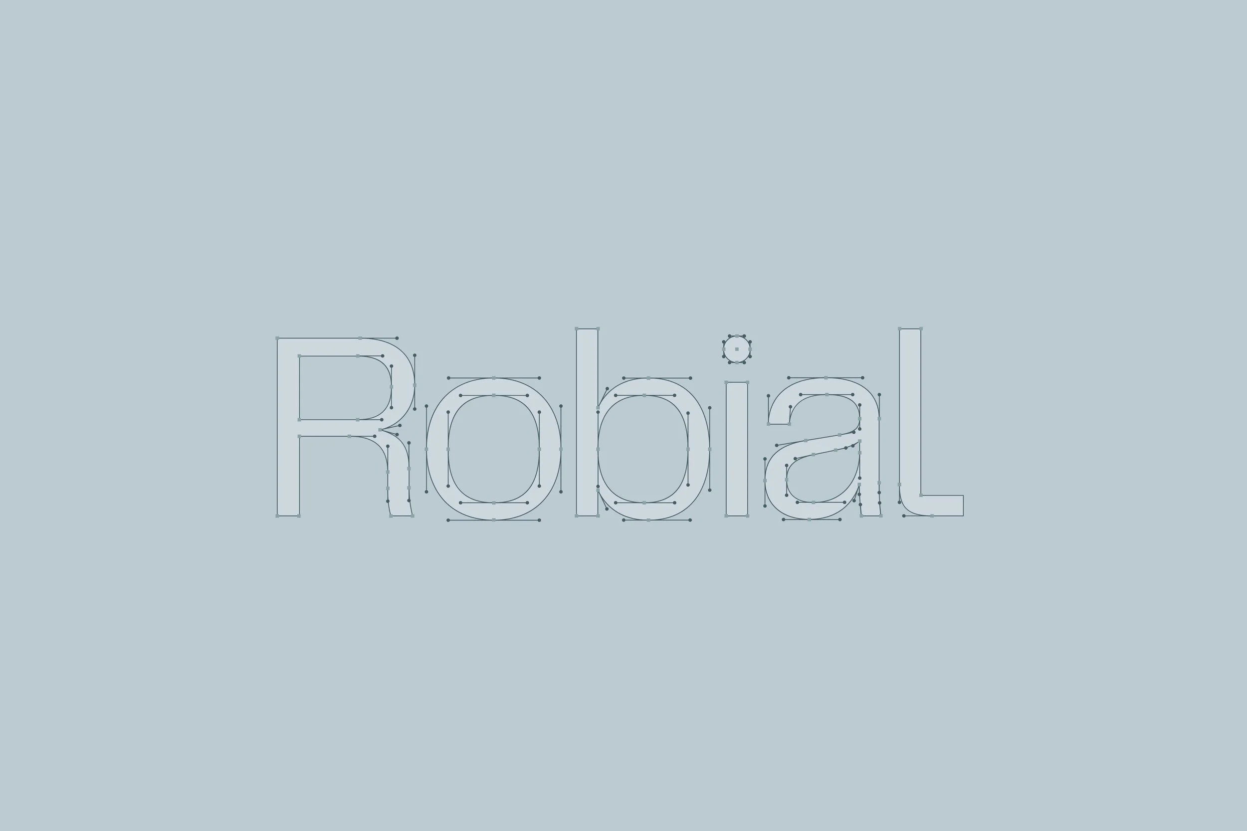
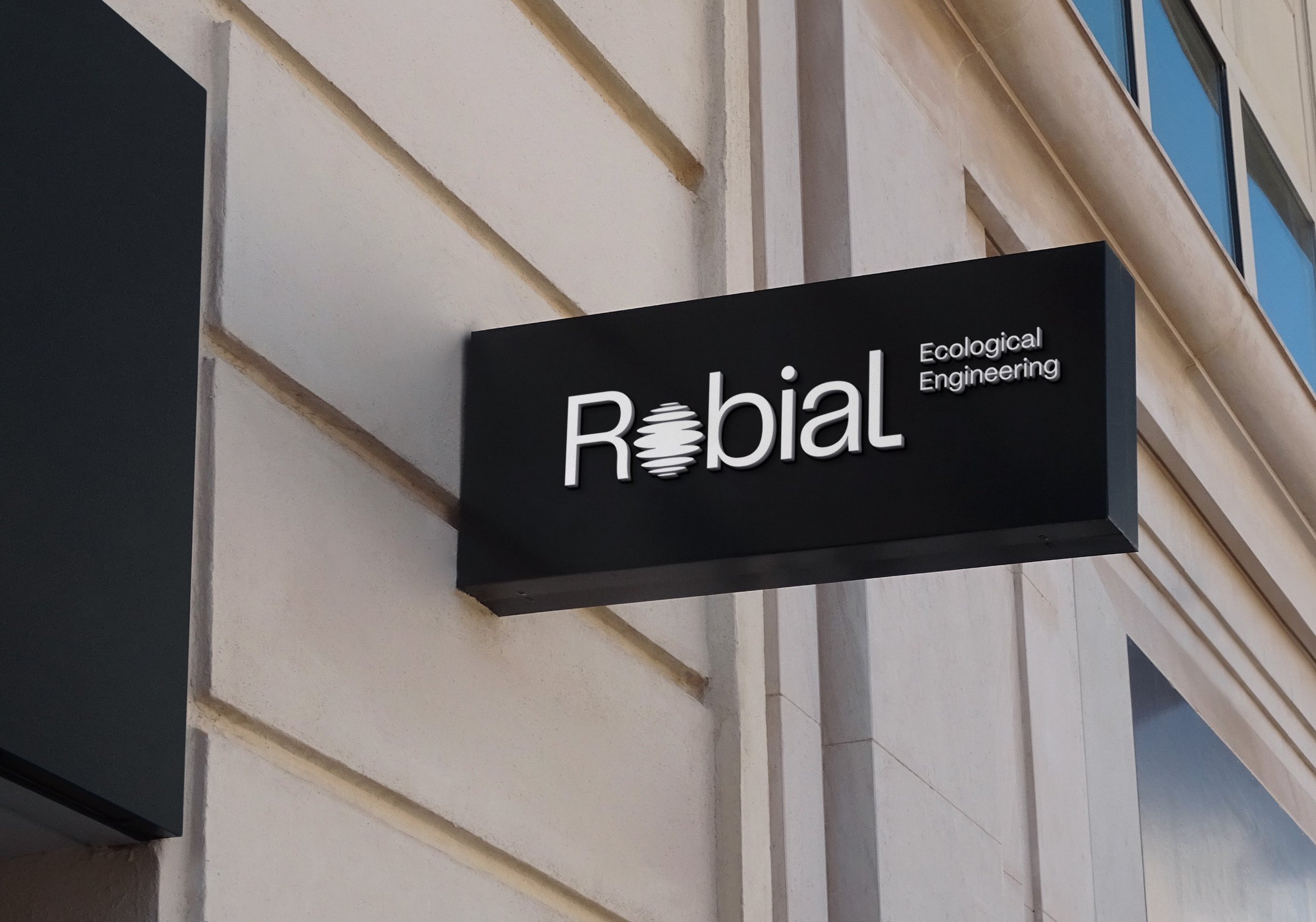
The logo system naturally took shape around the company name, which is itself a moniker for “microbial” and a direct reference to the differentiating element of the ecological engineering process. We opted for a custom logotype, using PP Telegraf as a base and integrating a brand symbol in place of the lowercase “o”. The symbol consists of a symmetrical series of diminishing oblong shapes, like light refracted on the surface of water.

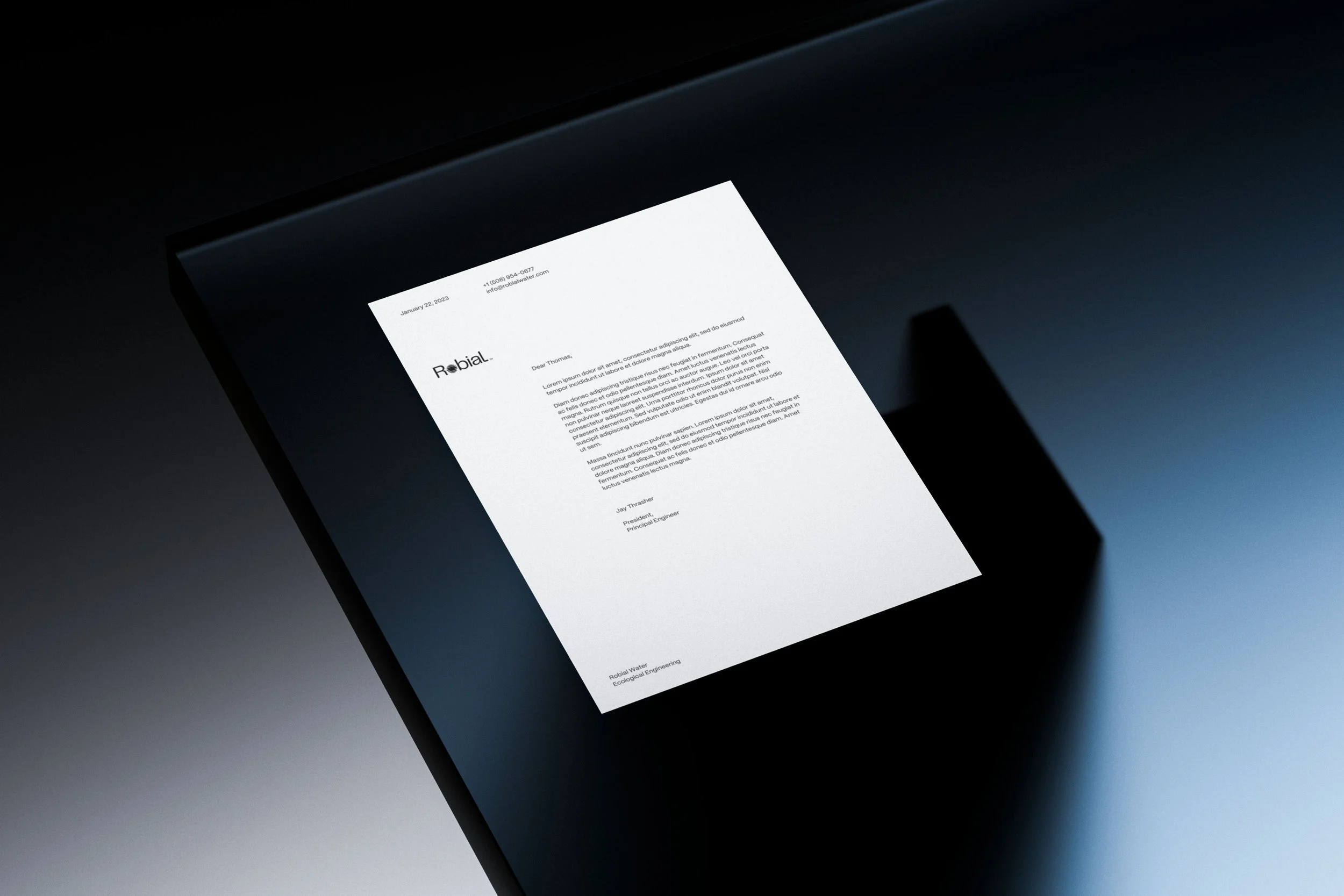
Robial’s identity needed to communicate with professionalism and polish while also remaining fundamentally approachable. Pangram Pangram’s Mori captures this friendly and functional tonal quality and provides an easy complement to the logotype.
The type system favors structure and simplicity, using Mori in only two weights but adhering to a well-defined hierarchy.
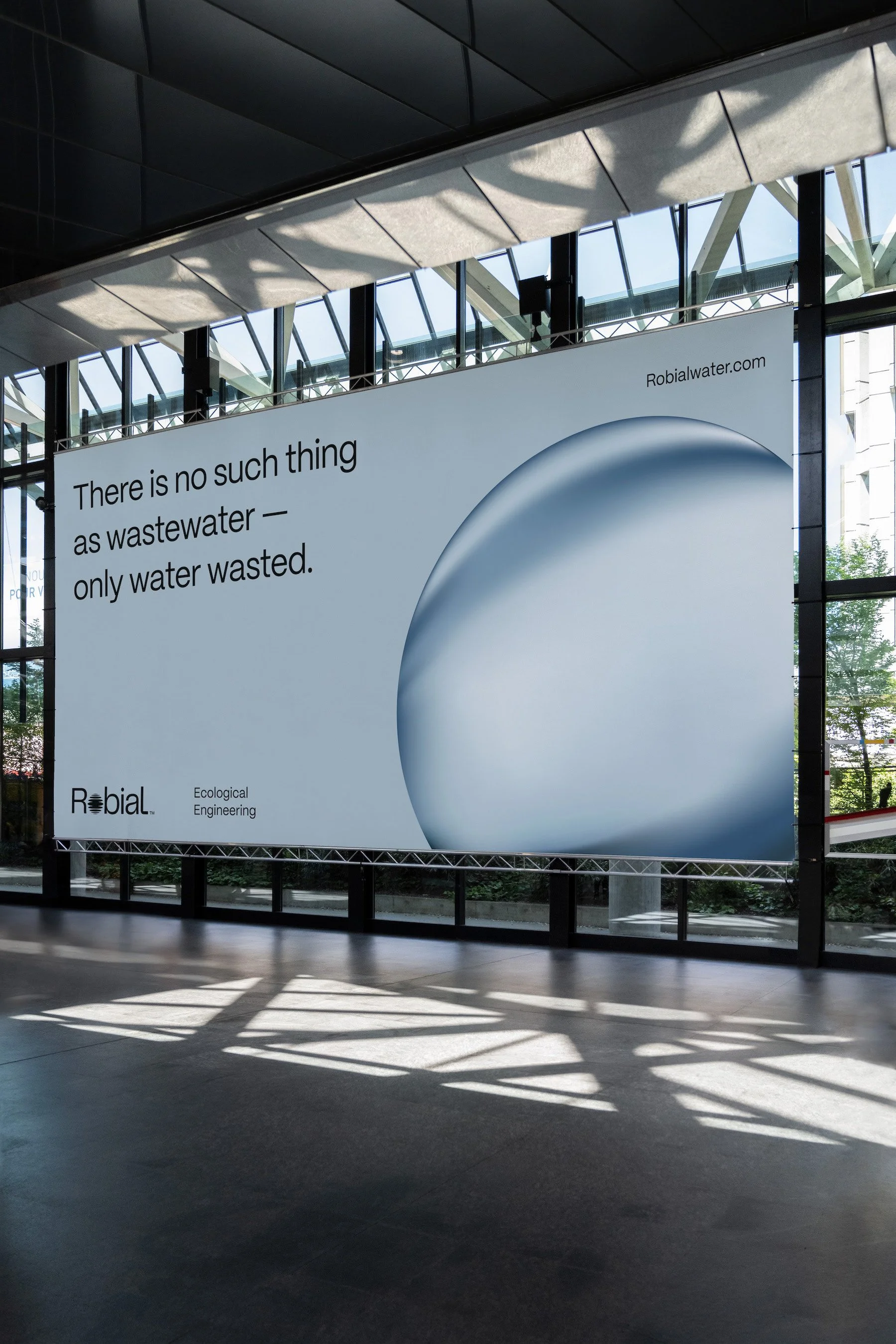
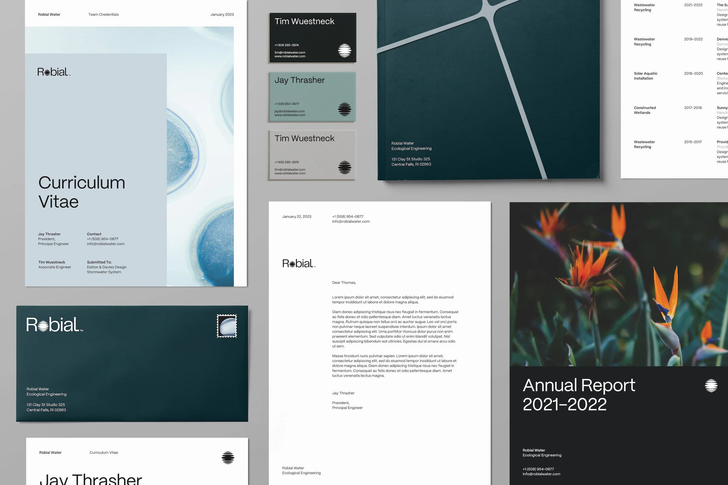

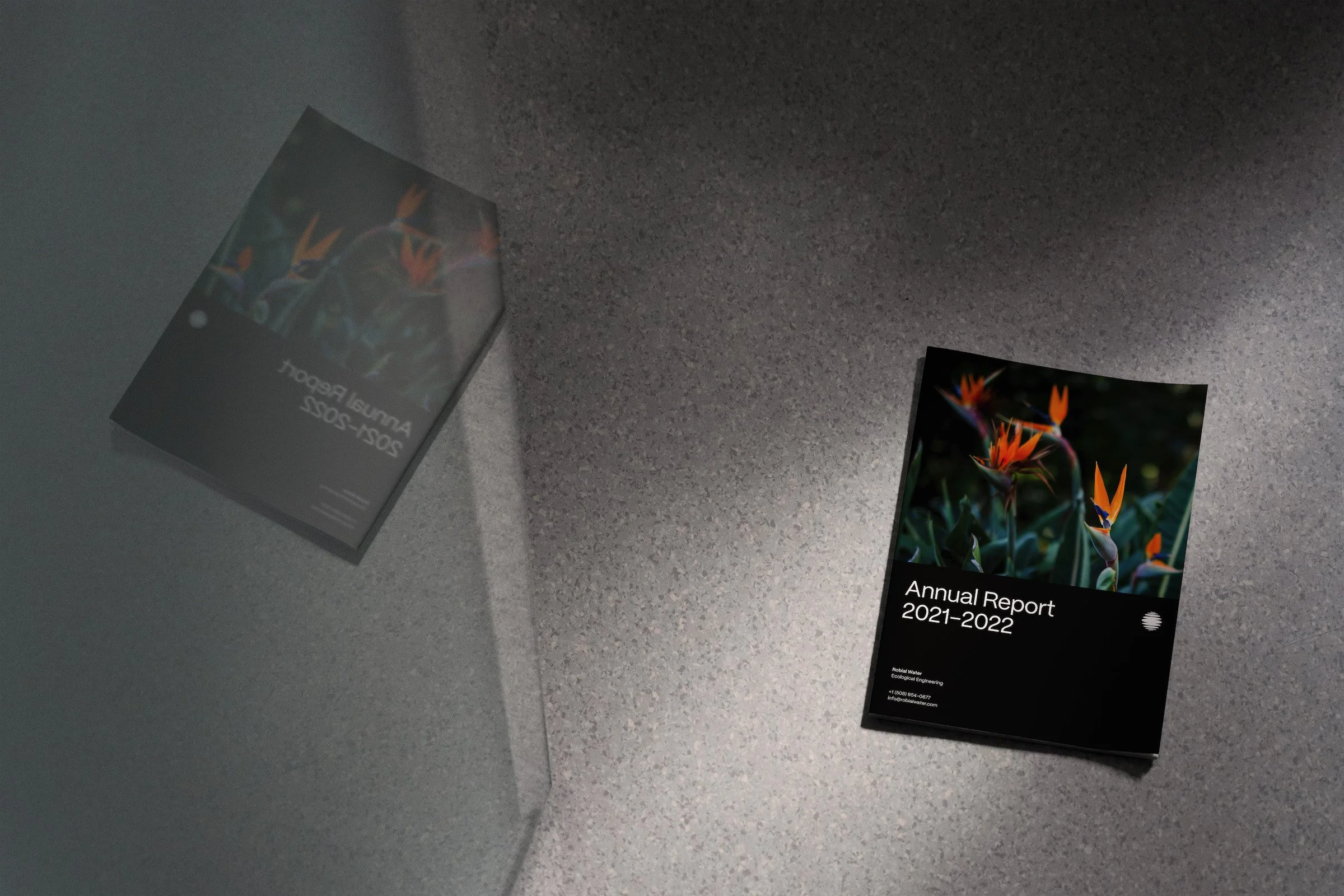
By intermixing images of healthy wetland ecosystems with modern architectural spaces, the photographic direction creates emotional resonance for Robial's target audiences while also building new associations with the material reality of wastewater engineering.
The guidelines we developed for the management of the identity system offer clear instruction on how best to integrate imagery, as well as editing tips to help the entire Robial team make the most of their on-site photos.
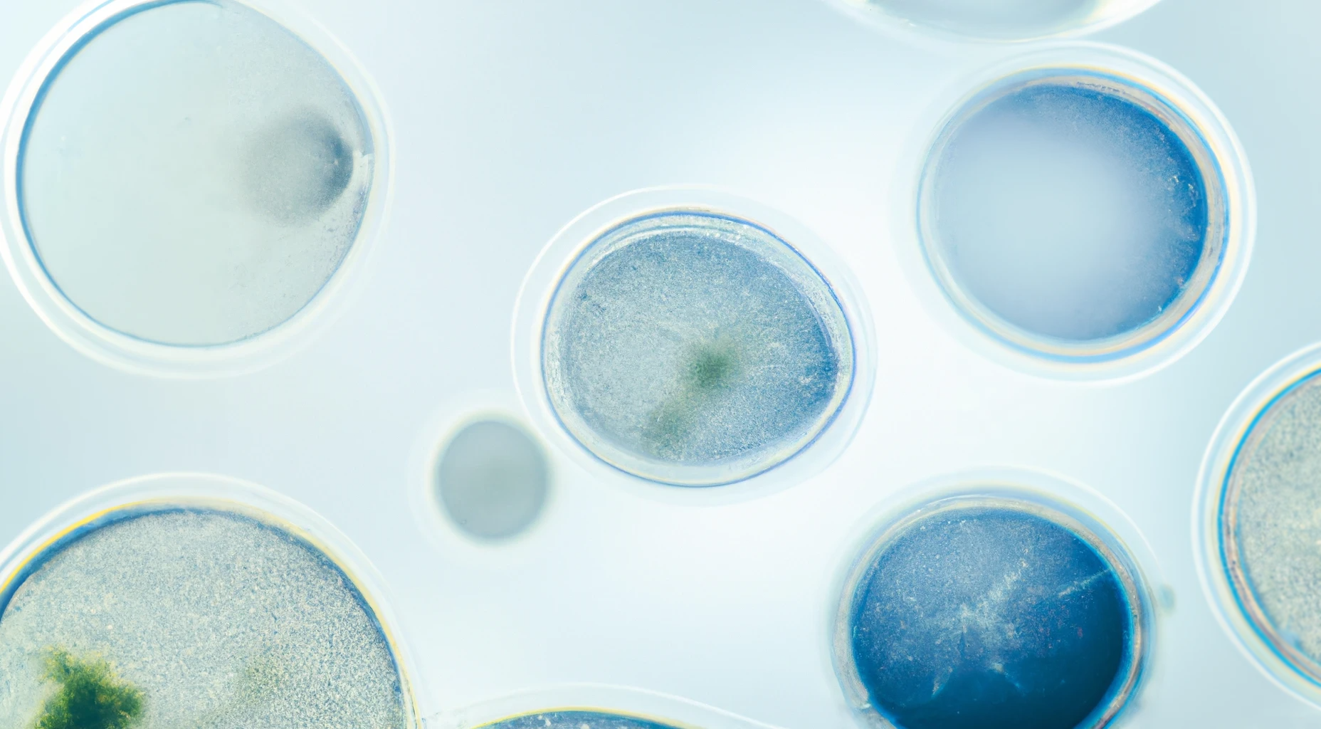
To supplement the brand’s photography, we used DALLE-2’s new outpainting feature to generate macro images of algae microbes, which we then refined in Photoshop.


Four Hundred Feet Brand Identity
Next Project
Four Hundred Feet helps researchers, NGOs, and social good organizations design and implement drone programs in the humanitarian, environmental, and global health sectors.

LET'S WORK TOGETHER
LET'S WORK TOGETHER
