
House of Pod
House of Pod is an award-winning production company that creates podcasts at the intersection of science and social justice.
SCOPE
Branding Strategy
Logo Design
Visual Identity
Copywriting
Brand Guide
Company Deck
Print
PROJECT
Rebrand
YEAR
2021
House of Pod is an award-winning podcast production company and inclusive community space in Denver, CO. After struggling to scale a homegrown brand for several years, the team invited Mammmal to give the company a visual refresh and to develop an identity as vibrant as the community they serve.
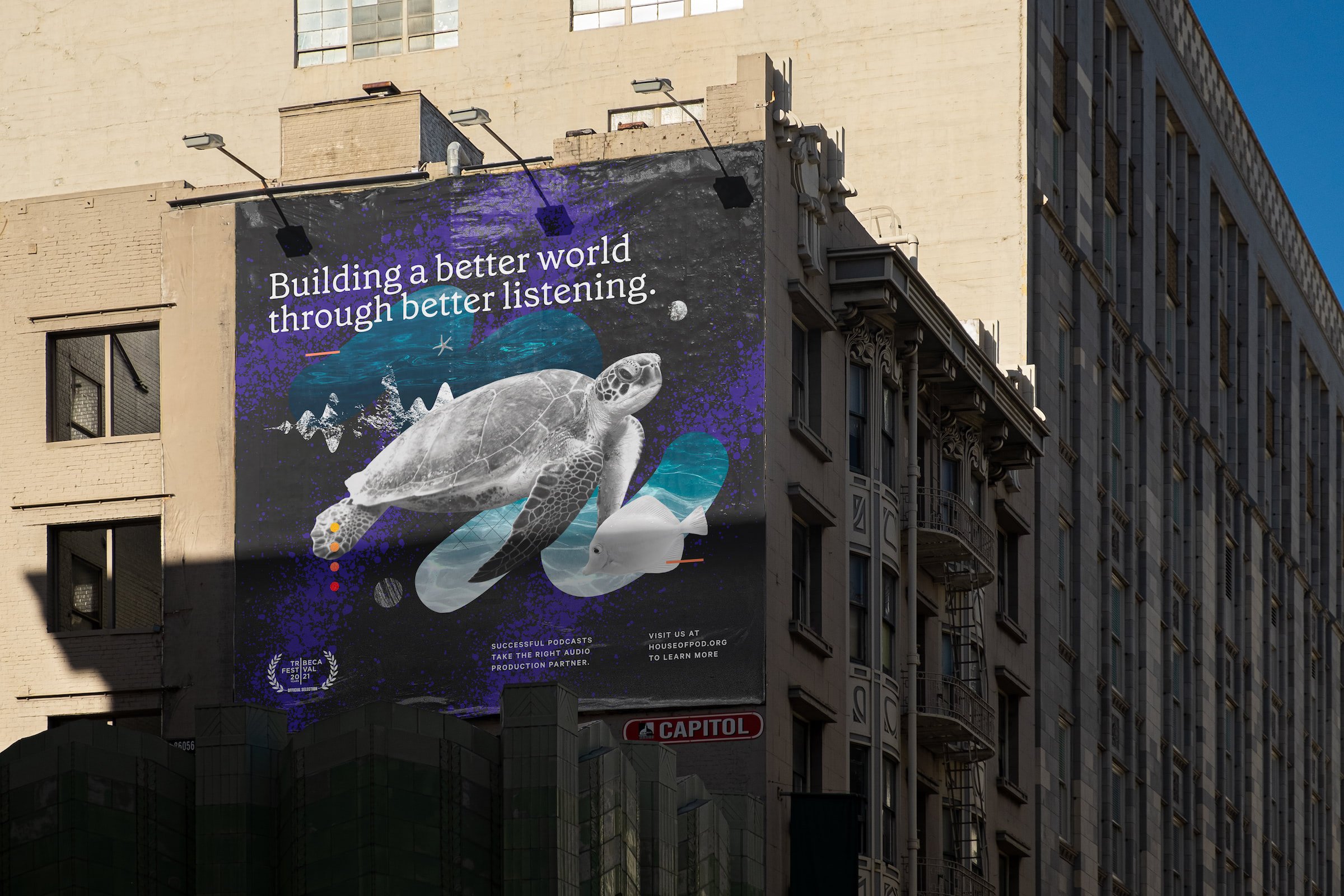
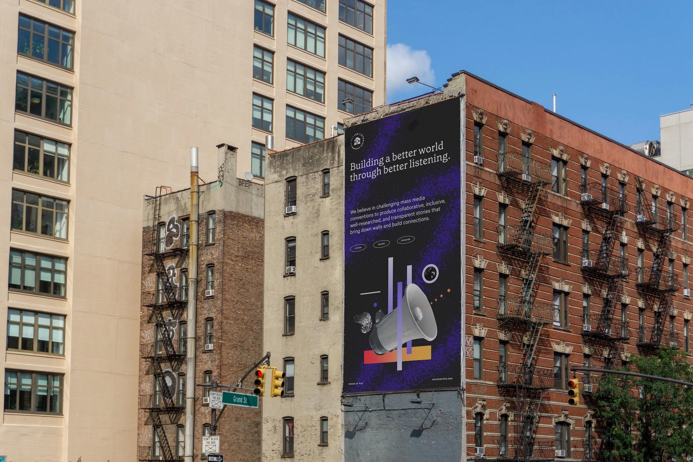
One of the design considerations prioritized in the brief was a desire for the new brand identity to pay homage to House of Pod’s Curtis Park location. We felt it was paramount to celebrate the cultural significance of the neighborhood without infringing on the creative property of the historically marginalized communities who have contributed to making Curtis Park the artistic hub that it is today.
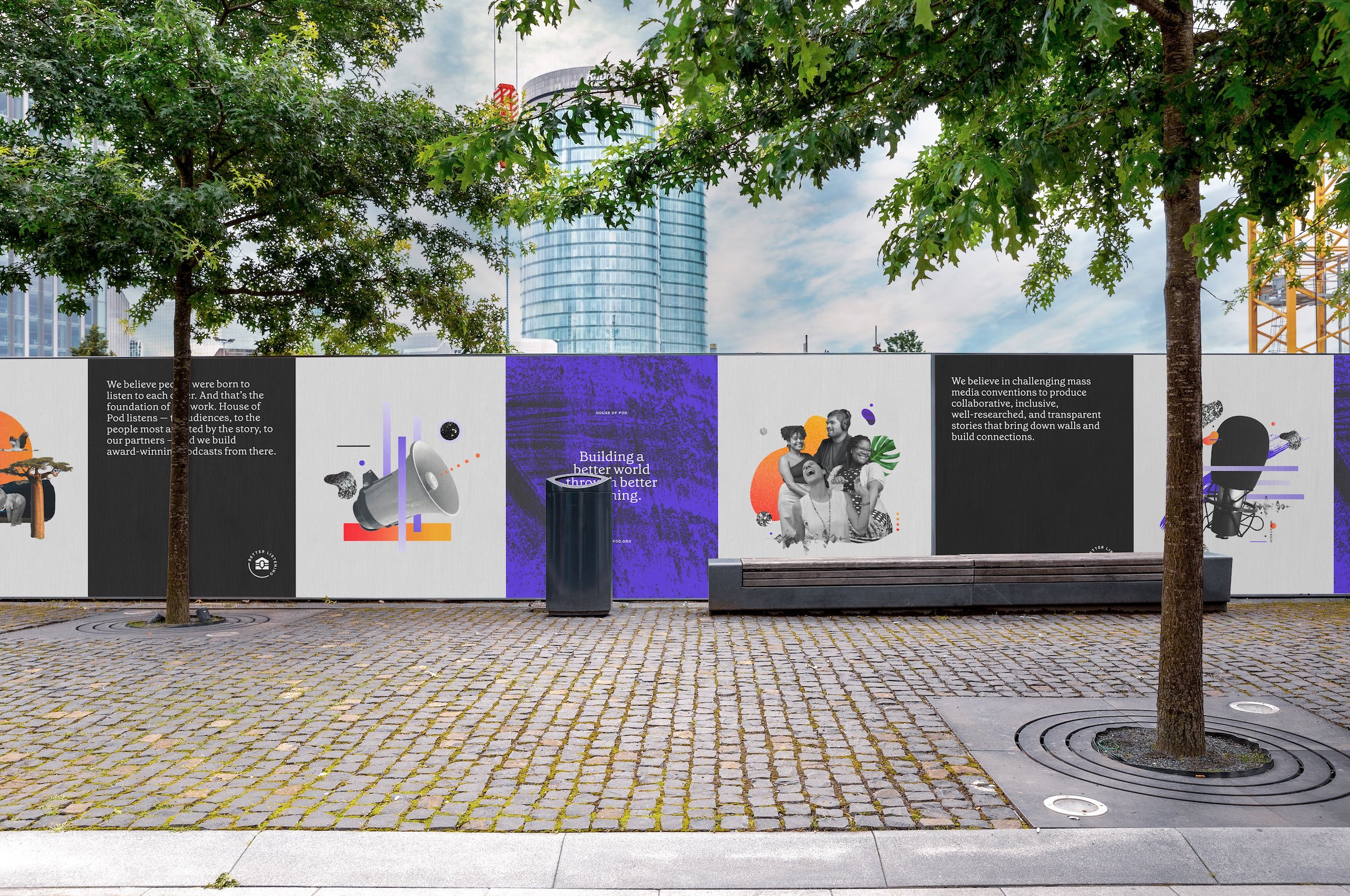
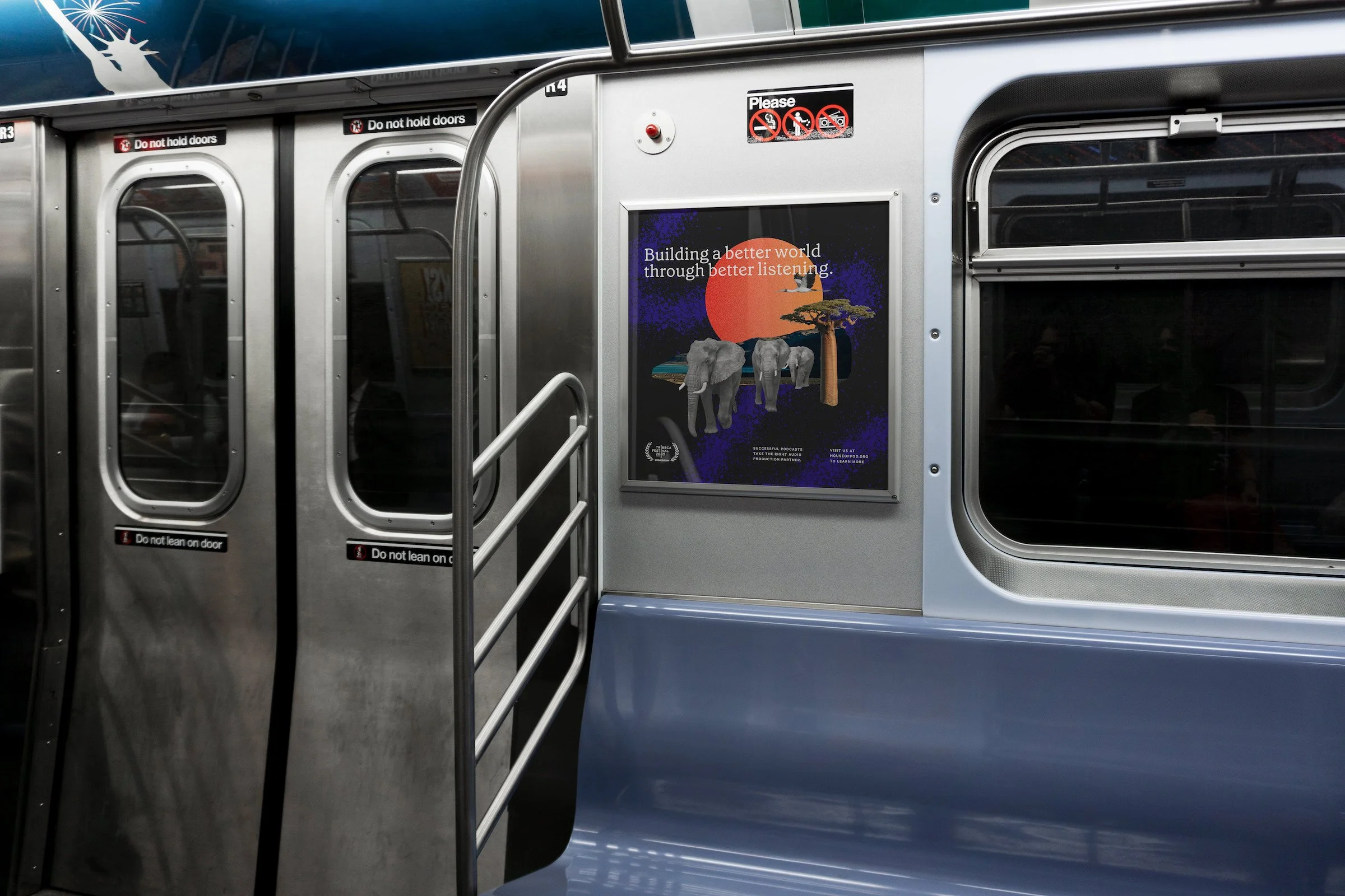
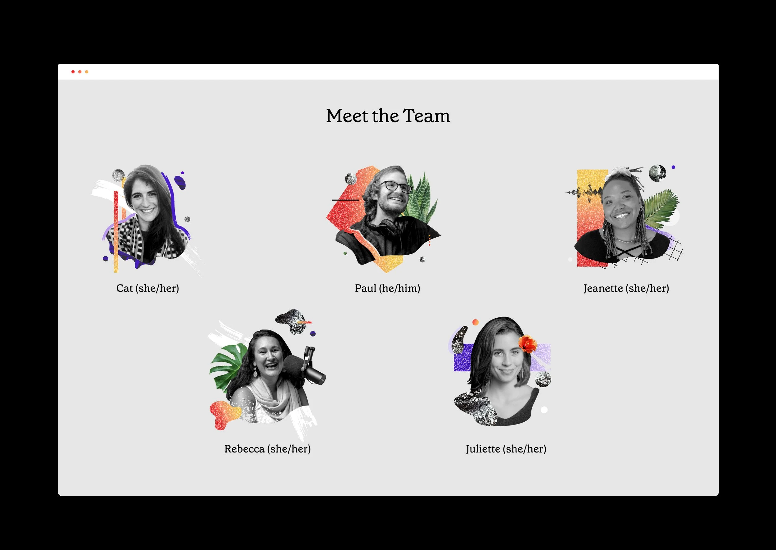
Bearing these parameters in mind, we adopted a mixed media approach that incorporates textural elements as key visual cues; isolated concrete textures, graffiti sprays, and clipping masks over paint strokes allude to Curtis Park's internationally renowned street murals. Meanwhile, black-and-white photography of people, flora, and fauna provide contextual evidence of the social and environmental issues tackled in House of Pod’s productions.
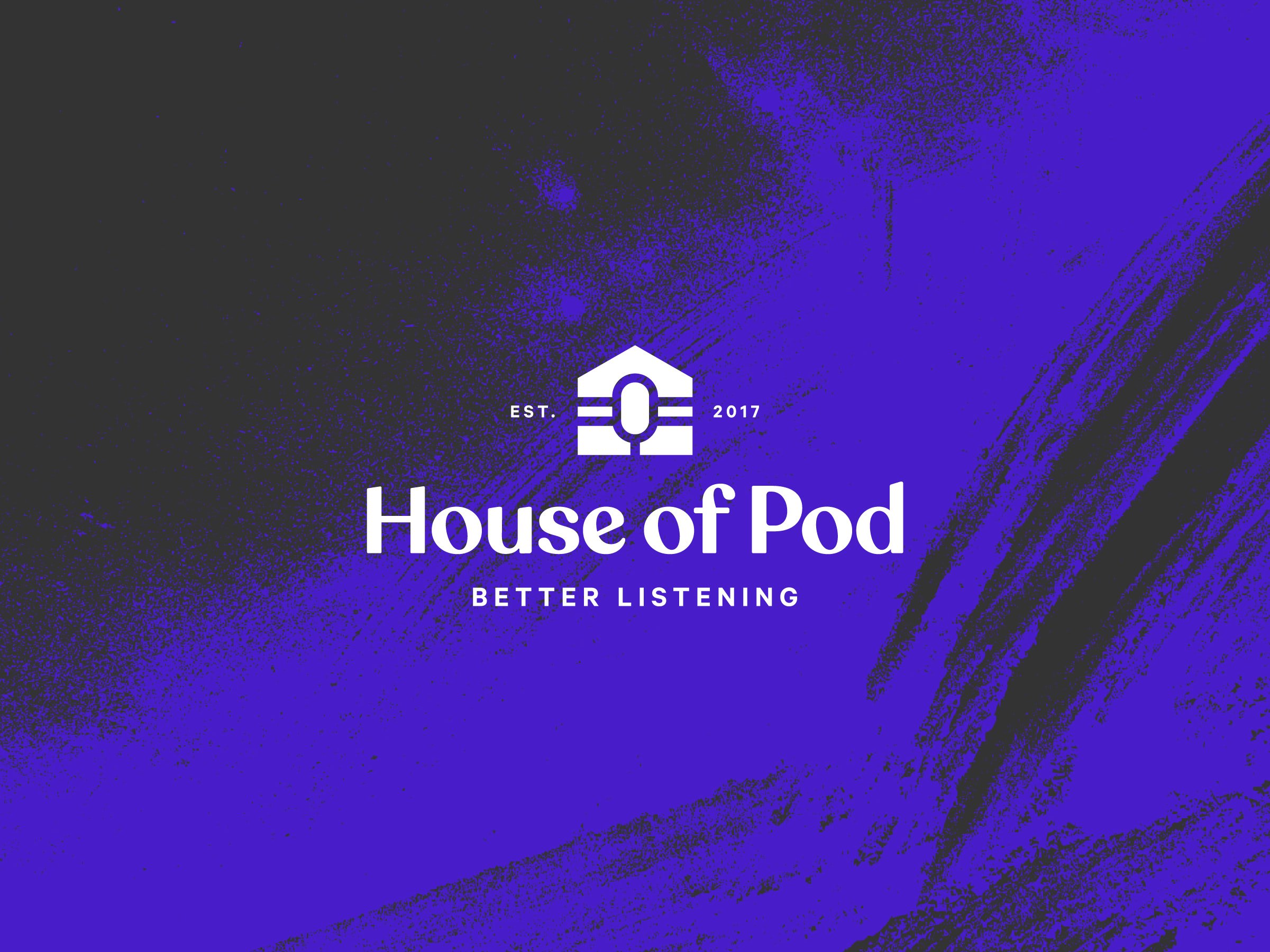
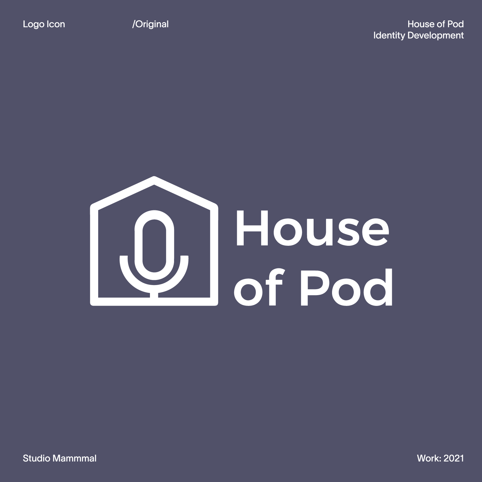
During our development of House of Pod's new identity, one of the creative challenges the team set forth was to rework their existing logo while preserving the content of their trademark: an icon featuring a microphone centered within a house.
Our explorations yielded both explicit and conceptual homages to the original icon. The team’s final selection features a microphone bound on both sides by an equal sign, a nod to the company's ongoing work to create greater equity and representation in the podcasting space.
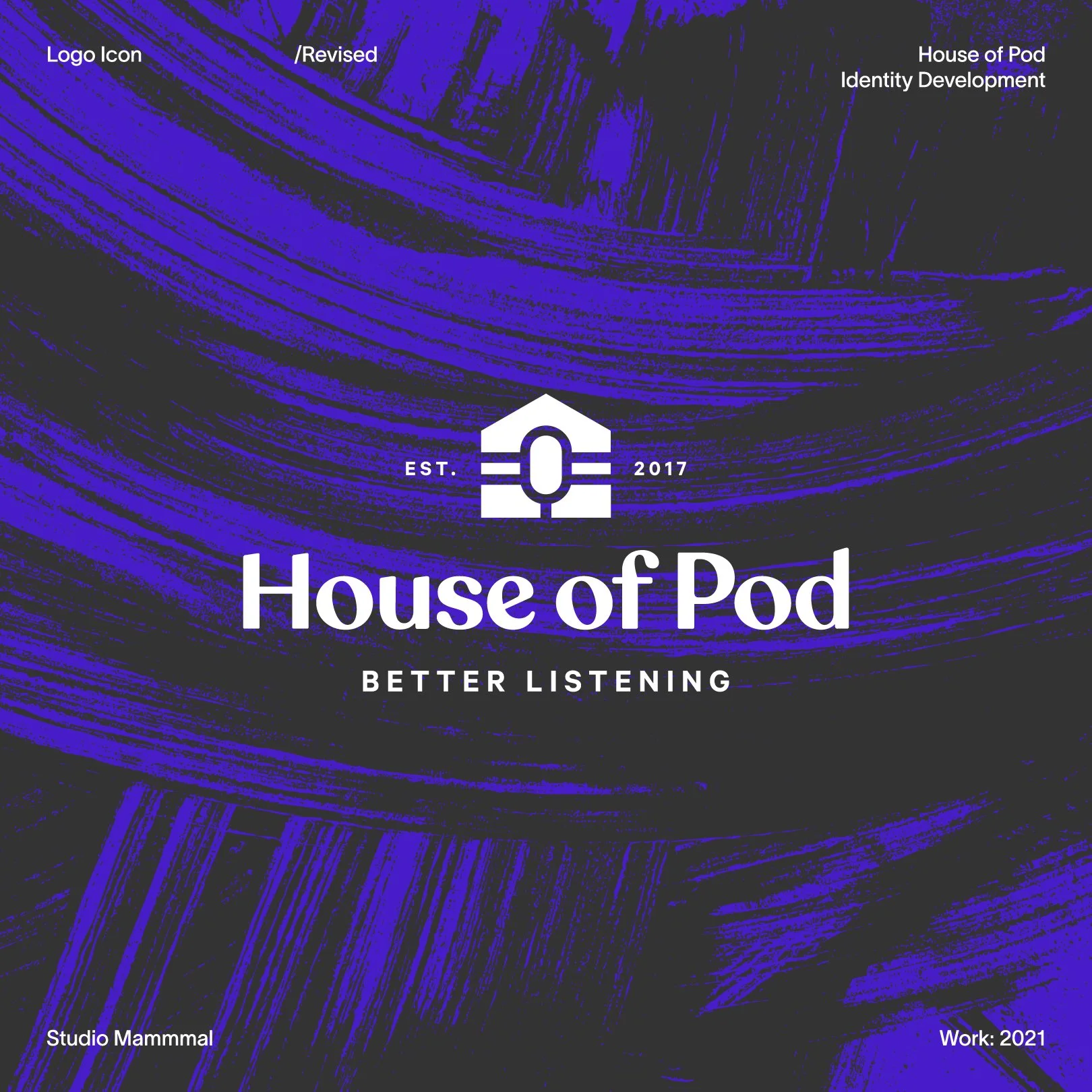

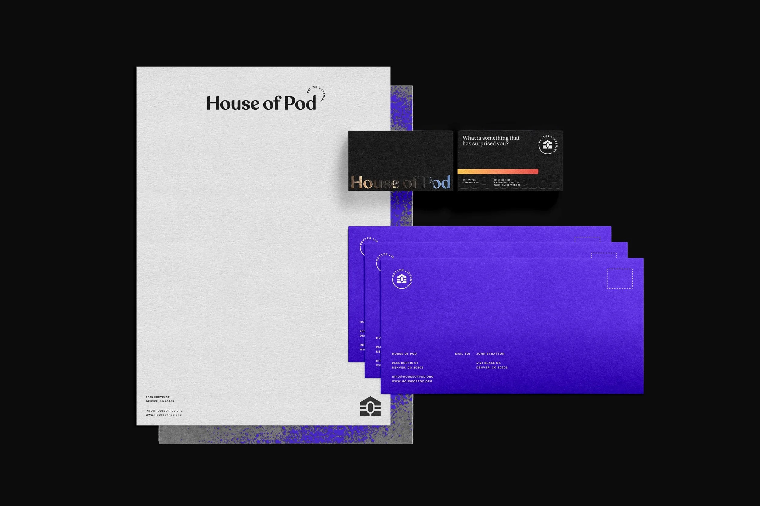
Changing the world through stories of social and environmental justice is not subtle work, and neither is House of Pod’s new identity. To celebrate the brazen spirit at the heart of the company, we selected an unapologetic ultraviolet as our hero color, contrasted with warm and energizing gradients of gold, persimmon, and hibiscus. Meanwhile, the type system drops all pretense, with a super-friendly pairing of Klim Type Foundry’s Calibre and Colophon Foundry’s Grenette.


Kind Words —
“I cannot think of more creativity, craft, compassion and talent than what we’ve gotten to experience working with Studio Mammmal.”
- Cat Jaffee
House of Pod
